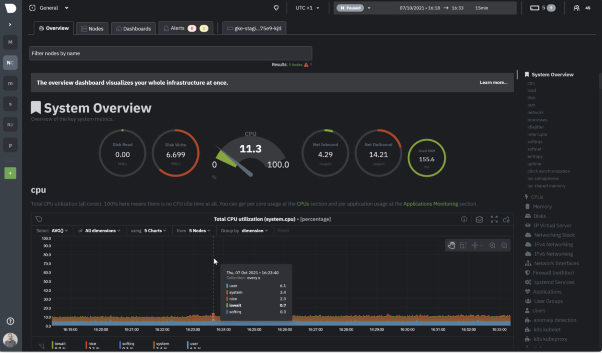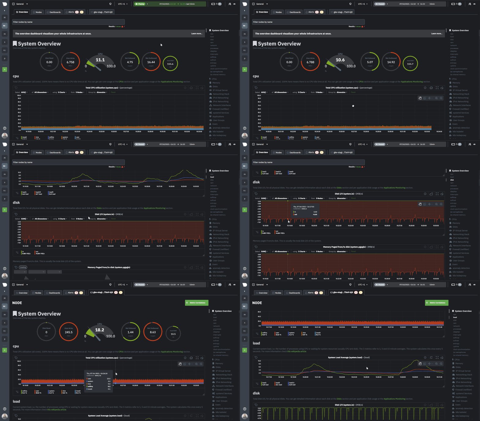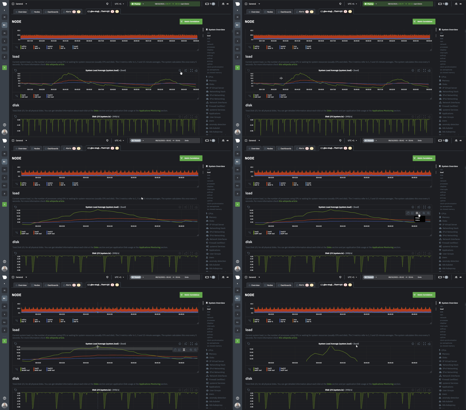
Netdata excels in collecting, storing, and organizing metrics in out-of-the-box dashboards for powerful troubleshooting. We are now doubling down on this by transforming data into even more effective visualizations, helping you make the most sense out of all your metrics for increased observability.
The new Netdata Charts provide a ton of useful information and we invite you to further explore our new charts from a design and development perspective. As always, it’s our goal to be as open and transparent as possible with our users on all things Netdata, including the ins and outs of how Netdata is built, why we make certain design decisions (driven by you of course!), and where we are heading as we continue to grow.
With the new Netdata Charts you can:
- Enjoy the same high resolution and granularity of metrics collected you expect from Netdata with even more clarity
- Explore visualizations with more options, such as Line, Stacked, and Area types. Bar, Pie, Gauges will be added shortly, and then even more to come
- Examine all the metrics where your cursor is with a tooltip. We are already cooking up an advanced tooltip that will give you all the required aggregations to make sense of your data – min, max, coefficient variation, standard deviation, and volume, when applicable
- Use tooling and shortcuts to pan, zoom, or highlight your charts
- Easy access to Metric Correlations when you highlight charts to view which other metrics have similar patterns
- Have the dimensions sorted based on name or value as you please
- Use full-screen mode
- Read useful information about the chart, its plugin, context, and type
- Get the chart status and possible errors. On top, reload functionality

New chart engine underneath
In order to support the growth of the product and continue to bring new features to our users, we have re-engineered our front-end app.
The first BIG task was to identify what chart library would best support our requirements. Since Netdata charts are highly granular with per-second metrics, the application requires functionality for visualizations that are frequently changed. The charts are augmented with a range of capabilities like panning, zooming, and other actions. We wanted, andneeded, to keep the core chart functionality as lightweight as possible in terms of bundle size and dependencies, since we plan to embed them in third-party environments.
Considering the above, we avoided solutions that are based on a specific framework, like React, for two reasons.
- We create dependencies that are in a library that will cause issues in the third-party integrations
- Tools like React perform based on instance reference changes. This pattern does not execute well with frequently changed bulk data.
After investigating many solutions, we concluded that thedygraph chart librarywas the most suitable method because the solution could handle hovering synchronization in numerous charts with many data points. While there are other solutions that may display information in a more attractive presentation, we decided that providing you with fast, reliable functionality was more important than minor aesthetic concerns.
After this decision was made, we reviewed our application architecture to find ways to make it modular, scalable, and with a focus on decoupled components. This lead us to make the following enhancements:
- We decoupled the charts completely from the Netdata Agent repo, to provide the ability for charts to be used as standalone components on any app that needs them
- We kept it framework-free (no React – vanilla js) for the main chart engine, so users can use however they see fit with no concerns on there are no dependencies upon integration
- We introduced containers, so that you can optionally create custom dashboards of grouped charts and see these in sync with the rest of the group while others keep their own context. You can nest charts and their containers as you like.
- We implemented events and listeners. Those who use events and listeners on their apps have access to what’s occurring under the hood through exported listeners.
Design upgrade
You ask, we listened! We redesigned charts by initially creating a prototype that was based on real user testing and feedback. Because we have a massive user base of both beginners and IT pros, we made it our goal to drive wide user adoption by developing more powerful troubleshooting, while maintaining the ease of use factor
The challenge was adding this new, rich functionality with a lean appearance to drive focus toward the information represented by the graph of the chart. But we have managed a presentation that brings functional items to attention as a user focuses on the chart Using our product research gathered, we optimized the experience which incorporates both the previous and new patterns that were analyzed. Finally, we structured the information in a hierarchical way. This was done to reduce cognitive load while maintaining the modularity necessary, which will support more advanced features requested by the Netdata community in the future.

And more to come
We will be bringing you many more exciting new features in the upcoming months. By popular demand, some of what’s to come include features like annotations, metric filtering, and alert overlays. Volume ratios are also the roadmap, which will provide you a comprehensive way to view how your metrics perform in comparison with past timeframes, as well as more tooling to get more information out of your data for increased observability.
Enjoy and stay tuned!